
Today, Lookback completes its brand refresh. I wanted to give you insight into the changes we made because it’s you, our customers, who’ve inspired us.
Thinking
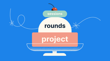
Lookback started as a beta tool to help designers, developers and researchers better understand their user’s on-screen experiences. Over eight years, it has become much more than that: a platform that brings product and service makers closer to their customers. Lookback now extends to off-screen experiences with products like Interview. As a result, you connect deeply with your customers, extracting key insights that affect decision-making in your organizations.
Thinking
Lookback started as a beta tool to help designers, developers and researchers better understand their user’s on-screen experiences. Over eight years, it has become much more than that: a platform that brings product and service makers closer to their customers. Lookback now extends to off-screen experiences with products like Interview. As a result, you connect deeply with your customers, extracting key insights that affect decision-making in your organizations.
We partnered with Focus Lab to help define and visualize our core brand attributes to better represent our culture and customers.

Wordmark
Lookback offers a bridge between digital and human. Our Wordmark represents this connection by combining Serif/Sans-Serif.

Brandmark
We wanted a Brandmark that represents the process of creativity, iteration and learning. This process inevitably leads to the holy grail of discovery and what Lookback is designed for: Insights.
Our squiggly-light bulb represents the journey toward the *aha* moments we strive for in our quest for better customer understanding.

Brand Colors & Accessibility
Color can showcase emotion and representation. Therefore, we wanted our new color palette to allow for various emotions and diverse expression coverage. In addition, Lookback has a continued commitment to accessibility. This updated palette allows for more excellent contrast and a clear visual language in our Dashboard and our Participate apps, both of which have global usage by a wide array of humans.
Big shout out to Stark for making awesome tools that help us design and build with accessibility at all stages.


Brand Typography
Typography plays an essential part in our brand identity. It emphasizes the human qualities of our personality – sincere and approachable – but also supports the balance of human intuition and digital relevance.
We chose Inter as our primary typeface for application UI due to its broad support and features for legibility.


Illustration
We landed on an illustration style that better represents our core values and characteristics. So today, we are transitioning to an approach that is more human, handcrafted and representative of the human experience.


Putting it all together


A huge thank you to our partnership with Focus Lab and our Customers. We experience daily gratitude and inspiration from the quality of customers we can serve.
As always, Happy Researching from myself and the Lookback team.
Craig James, CDO Lookback
Share this post: